Friday, 8 November 2024

Apartment Refurbishment in Alvalade, Lisbon, Portugal . 2024

Personal Project - Built

Keeping the 50's Vibe 

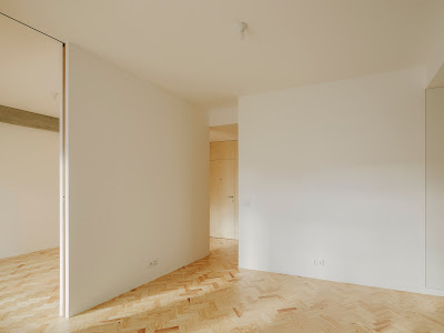
CONCEPT . Complete renovation of an apartment for resale, dating back from the 50's ("Estado Novo" period), whose concept essentially included maintaining and enhancing its original features, namely the solid wood parquet flooring, doors, staves and existing ceiling moldings, all carefully restored and, additionally, adding real value to it through the creation of a direct physical and visual connection (originally non-existent) between the kitchen, living room and balcony, taking advantage of its excellent sun exposure, ...


the addition of an additional toilet (ensuite), as well as the placement of in-built wardrobes in the bedrooms, perfectly integrated in the interior architecture and the replacement of a partition wall between the original disproportionately small living room and the adjacent bedroom with a "cobogó" screen, an accent wall that allows a flexible and multifunctional use of this space, whether as an extension of the living room (as a dining room), as an office space or even to be reconverted into a bedroom if the future buyer wishes.


MATERIALITY . The conceptual approach to this project, self consciously restrained, minimalist and which reflected the desire for "cost containment" of the respective client, involved the choice of a warm tones and soft textures material palette that followed the original 50's architectural language / vibe of the apartment, such as the "cobogó", a typical modernist architectural element, the cream microcement flooring in the bathroom and kitchen and the natural wooden deck on the balcony.


BEFORE & AFTER


Existing Kitchen


Existing Floorplan


Proposed Floorplan


CREDITS

Architecture » Pedro Dias | Architect
Construction Follow Up » Pedro Dias | Architect
Contractor » Foco Completo
Photographs » Do Mal O Menos
Client » Private Investor

Wednesday, 17 January 2024

Apartment Refurbishment in Laranjeiro, Almada, Portugal . 2023

Personal Project - Ongoing

Disproportions & Rebalances

CONCEPT . The concept behind this “Low Cost” apartment refurbishment, located across the river in the south suburbs of Lisbon, was basically to demolished all the partition walls located between the existing entrance hall, kitchen and living room, I’m order to create an open space subdivided in 4 clear defined spaces: an open kitchen, a low ceiling dining area, a low ceiling breakfast area and a higher ceiling living room area,as well as to reconfigure / rebalance the disproportion between the existing spaces.

In order to reduce substantially the area of the existing entrance hall, way too big, a new recessed translucent “cobogó” wall (open brick wall) was placed in the middle of it, allowing roughly 50% of its original area to be reduced / given to the living / dining area and natural light to flood in. In the opposite side of the apartment 2 other major changes were introduced: the transformation of a small shared toilet into an en-suite bathroom and the virtual “displacement” of an existing partition wall located between 2 of the bedrooms, one too narrow and the other one generously wide, in order to, once again, rebalance the disproportion between existing spaces. 

MATERIALITY . The color and material pallet followed a minimalistic approach. Basically, the majority of all the surfaces are white with different textures (plaster on walls and ceilings, white painted “cóbogo” wall, handmade kitchen backsplash tiles and powdercoated lower kitchen cabinets) in contrast with a more warm light oak wooden floor and the living room inbuilt furniture and upper kitchen cabinets made of birch plywood panels. The result: an unpretentious, warm, simple and elegant apartment. 


BEFORE & AFTER

Existing Kitchen

Existing Floorplan


(click for 360º view of Living Room vs Kitchen)

CREDITS

Architecture » Pedro Dias | Architect + André Marques
Client » Private Investors

Saturday, 8 April 2023

Apartment Refurbishment in Av. EUA, Lisbon, Portugal . 2023

Personal Project - Built

Just (Re) Do It!... 

EXISTING SITUATION Located in the center of the popular Alvalade neighborhood in an iconic modernist building from the 60`s, this small apartment, which was pretty damaged.and uninhabited for more than 20 years, had no particularly interesting original features (apart from some half broken floor cement tiles, unfortunately, not recyclable). and clear incomprehensive disproportions between its spaces. It lacked natural light, cleared views towards the outside and had an overall claustrophobic gloomy feeling. 


THE MAIN IDEA . The conceptual approach was radical and pragmatic. to demolish everything and strip down the apartament to the bone, virtually setting back as much as possible the partition walls between the existing living room (extremely small), and the adjacent toilet, bedroom and entrance hall (these last 2 both too big) in order to rebalance the referred proportions. Other 3 goals were set from the start; to create a fluid circulation between the 3 main spaces, achieved by placing a second door that connects directly the bedroom and the living room, which slides back allowing additional direct sunlight to flood the living room and a diagonal view from this space towards the existing balcony and its planter, the most important and valued original feature of the apartment, which was kept, deep cleaned and repainted. 


OTHER GOALS . Other goals were set in order to make the best spatial use of a rather small apartment, full of residual spaces and "conflicts" between its architecture and structural elements which "overlapped" it. Among them, feeling up many wall setbacks and residual spaces with niches and inbuilt furniture, such us a bookshelf in the living room, a few shelfs in the toilet, a built-in fridge in the kitchen, a walk-in closet in the bedroom and, in another hand, hiding from view a couple of existing beams by creating lowered plasterboard ceilings in the entrance hall, toilet, kitchen and walk-in closet, which also provided a spatial hierarchy in contrast with the 2 remaining spaces, living room and bedroom, both with higher ceilings. 

MATERIALS . The idea was to establish a subtle contrast between 3 groups of main materials or colours in order to create a light, warm and cozy environment: white surfaces in plastered walls, ceilings or white handmade tiles cladding in the kitchen backsplash and toilet walls, light color wood surfaces, like the use of traditional 1950´s pinewood flooring (same type of the damaged original flooring) and birch plywood panels in all the doors and in-built furniture and contrasting concrete surfaces in the remaining visible beam and columns of the bedroom and toilet floor. In the living room a bulky existing beam had its plaster covering removed in order to expose its ruff pastel coloured textured surface, which matched the pastel color sandstone of the existing windows and toilet counter, as well as its niche, and transform it into a central feature piece (as they say, "if you can't beat them, join them"...;) 

BEFORE & AFTER


Existing Kitchen

Proposed Kitchen


Existing Floorplan


Proposal Floorplan

DETAILINGHigh attention to detail was given in order to create a simple, elegant and seamless design. This minimalist approach is most visible in the floor to ceiling custom made pivoting doors and absence of door handles on inbuilt furniture cabinet doors, among other details… The result was a positive vibe, warm, natural light flooded, cozy apartment with, as another architect colleague of mine described it, “Nordic feel”…I took it as a compliment. ;)


CREDITS

Architecture » Pedro Dias | Architect
Construction Follow Up » Pedro Dias | Architect
Contractor » RCU - Reabilitação e Construção Urbana
Photographs » Hugo Santos Silva
Client » Private Investor

Monday, 27 September 2021

Low Cost Apartment Refurbishment in Almada, Portugal . 2021

Personal Project (partnership with André Marques) - Built

Keep Ego and Budget Under Control...

CONCEPT . With an extremely tight budget, and us as our clients (though job this one), the main challenge of this project was to keep our own architectural ego under control, not overspend and not do "tabula rasa" of an apartment with some interesting original architectural features... Our approach was pragmatic, minimalistic and simple: to preserve and enhance as much as possible the apartaments original architectural features from the 50´s, mix them with "modernity" and add real value to it. Some of those included the wooden floor, doors, skirting boards and the kitchen chimney. 


MATERIALITY + MAJOR CHANGES . The choice of new cladding materials, such as the mosaic floors and tiles of the kitchen and toilets were determined by this tight budget and followed this 50's "vibe". From a spatial point of view 4 major changes were introduced to the apartament: the kitchen, which was totally renewed, having the original chimney as its anchor, the toilet, too big, completely outdated and with a inefficient layout, which was transformed in two, one of which became ensuite, the 2 bedrooms which were equipped with fitted wardrobes replacing a previous storage space located in between them and the balcony, which had its original mosaic tiled floor preserved, as well as its original balustrade and open up again by removing its cheap anodized aluminium framed windows.


THE RESULT . The result was an apartment full of character, personality and natural light, with an outdoor space where our future client can enjoy plenty of sun bathing... Hopefully it will sell soon. 


BEFORE & AFTER


Existing Kitchen


Existing Floorplan


Proposed Floorplan

CREDITS

Architecture » Pedro Dias | Architect + André Marques
Construction Follow Up » Pedro Dias | Architect + André Marques
Contractor » Hélio Jorge Faria Caseiro
Photographs » Nuno Almendra
Client » Private Investor

Wednesday, 22 September 2021

Thursday, 11 February 2021

Apartment Refurbishment in Lisbon, Portugal . 2021

Personal Project  -  Ongoing

Location / Area: Campo de Ourique, 187 m2


Antes e Depois

01 Varanda 02 Sala de Estar 03 Cozinha 04 Sala de Jantar 05 Corredor 06 Lavandaria / Arrumos 07 Casa de Banho 1 08 Casa de Banho 2 09 Quarto 1 10 Quarto 2 11 Antecâmera / Escritório 12 Closet 13 Suite de Casal